I fixed the navigation. Completion barely moved.
Almost half of new users abandoned Emerson Suite before completing their first goal plan. I fixed the visibly broken navigation, but completion rose by only 7%. That measured miss revealed deeper friction in the goal setting method, so I reconstructed the methodology and redesigned both creation and the plan people managed over time. JEP activity increased by 61%, helping shape Emerson’s move into team performance management.
The first experience was teaching people to leave
When I showed friends the product I was about to work on, one comment stuck: “It looks like a poorly edited PDF document.” It was a cloud web app.
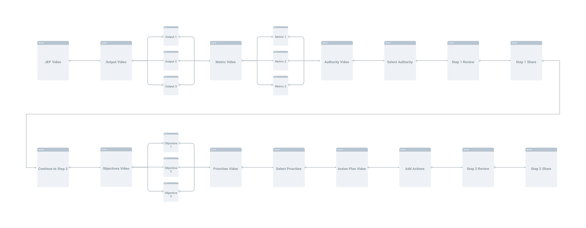
Creating a JEP, a Job Effectiveness Plan similar to an OKR, took six input steps, two review steps, and several learning and sharing steps. The back button behaved differently from page to page. Basic actions gave no feedback. The product had been designed mobile-first while more than 90% of users were on desktop. It took me days just to understand how to move around it.
The data was equally blunt: almost 50% of users never finished their first JEP. If someone failed on the first attempt, there was little chance they would return a week, a month, or a quarter later. The company was investing in acquisition and moving from a coach-leader market into team performance, but the core experience was losing people before they could reach the value.
That reframed the redesign around the whole relationship with a JEP. The first plan had to become easier to create, the desktop experience had to reflect how people actually worked, and the result had to remain useful enough for someone to return. Completion was the immediate problem; sustained use was the business problem behind it.
The first fix gave us a better diagnosis
I started where the pain was loudest. I mapped how navigation actually behaved, rebuilt the structure, added a status indicator, and rewrote the button language.
Completion rose by about 7%. The result was smaller than I expected, and that made it useful. I had improved the wrapper around a process that was still asking too much of people. The team agreed to look beyond navigation and examine the methodology itself.
Separating the method from its software
The software was three years old. The methodology behind it was forty-five. To change the process responsibly, I had to understand which parts made the method work and which parts had simply accumulated in the interface.
I spoke with the company founder and with consultants who had used the methodology before it became software. I worked with the product manager and engineering team to reconstruct why earlier decisions had been made, then watched new-user onboarding sessions to see what happened when someone met the product without any of that history.
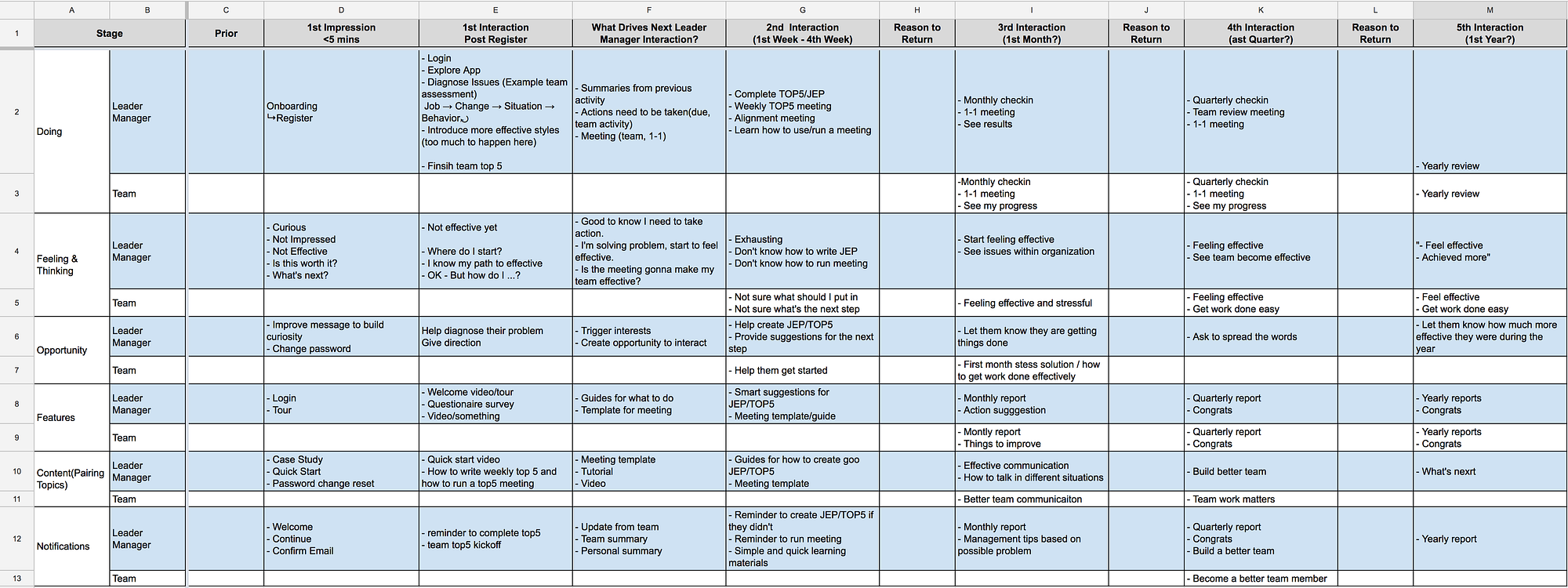
I also conducted six interviews across industries and roles to understand how people formed a plan and what brought them back to it. I refined the journey with the team, and it became useful beyond design by giving marketing and sales the same view of where the experience was losing momentum.
Designing for the person without a consultant beside them
With a consultant in the room, a person can hold several outputs, metrics, and objectives in their head while someone guides the conversation. Alone in a web app, they have to do both jobs.
The new process reduced that cognitive load by helping people finish an output, its metrics, and its objectives before starting the next. The methodology stayed intact, while the software took on more of the guidance a consultant would normally provide.
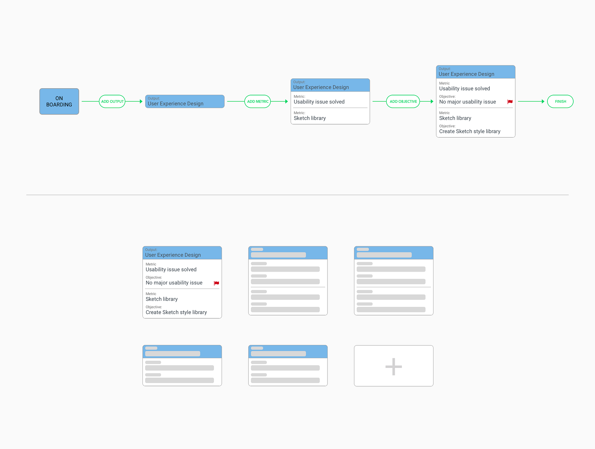
I prototyped the flow in InVision and tested it with existing users in their own offices. Every participant completed the process without trouble. The sessions also exposed assumptions that still needed work:
- Choosing a metric category created friction, even though it was not part of the original methodology. It had been added to help people think of a metric. In practice, people often thought of an objective first and worked backward; some entered the objective in the metric field and a number in the objective field. We removed the category, and later tests confirmed the decision.
- Inexperienced users still needed support when creating a first JEP alone.
- The same terminology meant different things to different people.
We also explored AI suggestions based on a person’s role and industry, drawing on forty-five years of accumulated data to help when they were stuck. The team later reprioritized and the idea was cut. The exploration still clarified where assistance could be useful: at the moment someone struggles to form the next step.
The object people would live with for a year
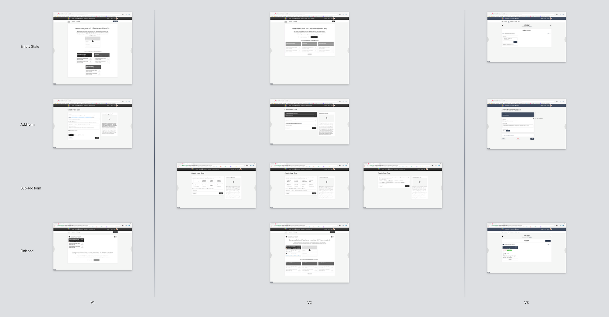
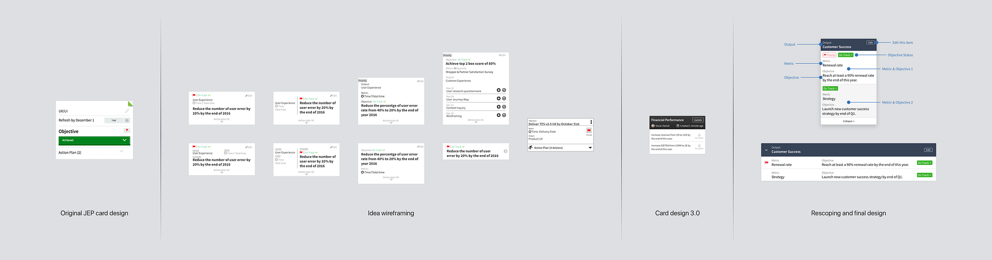
Creation was the beginning of a year-long relationship with the plan. Its structure had to remain understandable after the guided flow was gone. In the original, even experienced users struggled to distinguish outputs, metrics, and objectives or see which objectives belonged to the same output. Each page showed a single objective, so understanding the whole plan meant clicking through it piece by piece.
The redesign labels each layer, separates it by position and treatment, and groups metrics and objectives under the output they support. Every card appears on the same page. Many users had managed JEPs in Excel for years, so we kept a list view and gave them a familiar way to scan the plan.
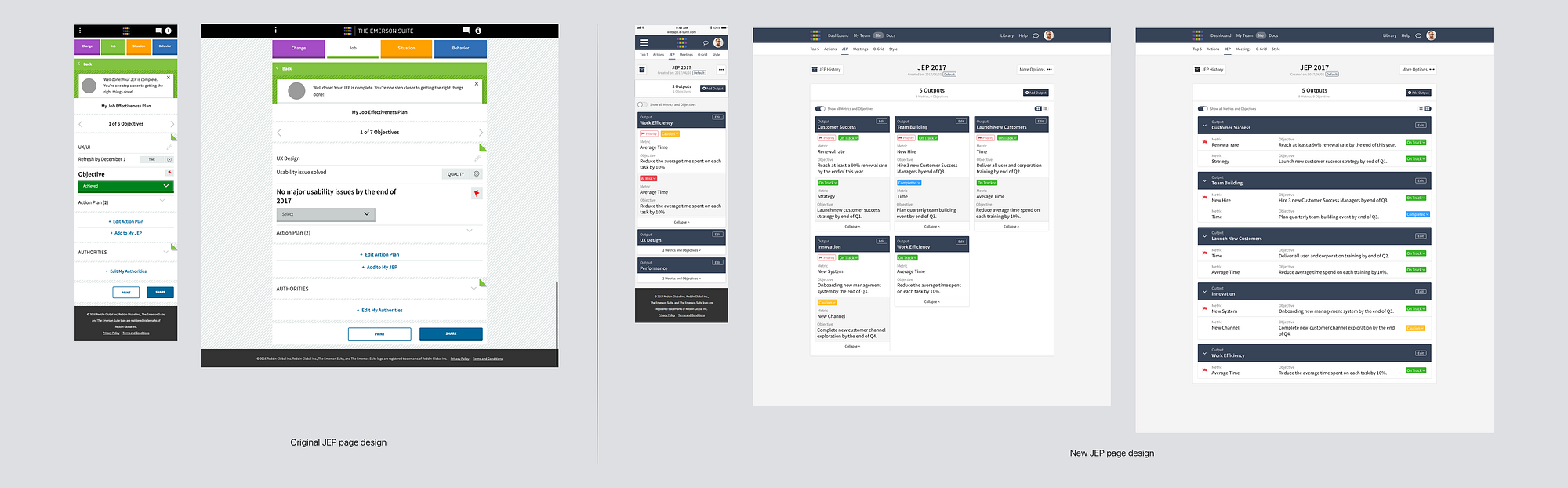
What changed
The redesign also became the company’s first step into team performance management. Its visual language and interaction patterns gave the other products a foundation to build from, so the work extended beyond the JEP flow itself.
What stayed with me
The 7% result taught me to value a measured miss. It challenged our first explanation and gave the team permission to investigate the harder problem. Much of the final redesign still grew from that early work.
I also learned to separate a method’s enduring value from the software decisions that had accumulated around it. That distinction helped us simplify responsibly and leave room for later releases without optimizing the current screen into a corner.
The write-up
I published the full account, with more of the research and the screens, on UX Planet. Read it on Medium ↗