People recognized their accounts by type and balance. Our navigation hid both.
Questrade Mobile organized accounts around numbers investors rarely remembered, making it difficult to know where they were or how their money was doing. Testing showed that people recognized accounts through type and balance, so I rebuilt the header, account list, performance view, and reordering around those cues. Switching became 25% faster, 92% found navigation easier, and access to detailed balances on the first interaction rose from 55% to 88%.
The first answer failed in testing
90% of users managed two to three accounts, and many held more than one account of the same type. The original tabs compressed those accounts into labels that were easy to scan and difficult to distinguish. The header also carried a larger job: help people judge the portfolio, understand the active account, and reach detailed balances when something needed attention.
Our first answer was to add account numbers to the tabs. People rarely remembered them. Testing showed that investors recognized an account through its type and current balance. That finding moved the team away from refining labels and toward rebuilding navigation around the way people already understood their money.
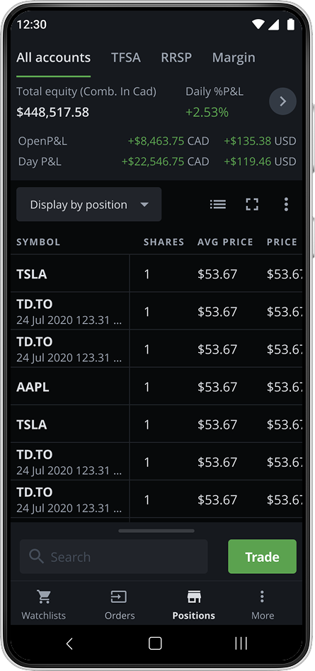 Before: tabs
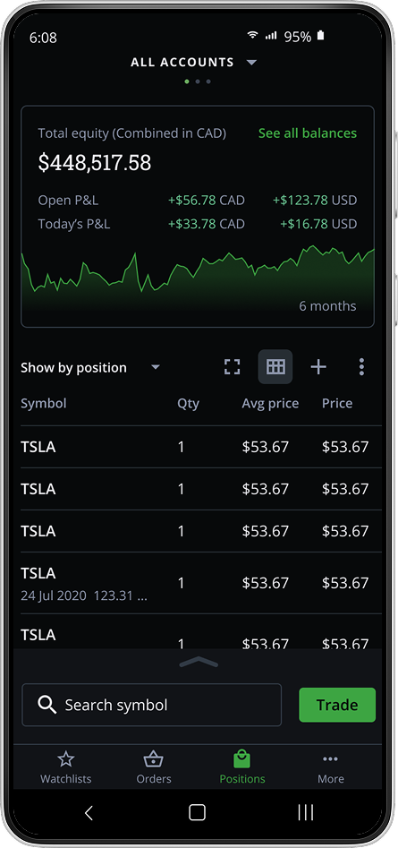 After: balance summary
A hierarchy built around investor decisions
Framing the problem around the decisions people were making gave us a clear hierarchy:
- Evaluate the whole portfolio at a glance. The first number should answer, “How am I doing?”
- Understand the active account. The next layer should make its performance and available balance clear.
- Move to the right account. Type and balance should help people distinguish accounts without memorizing identifiers.
Testing the tradeoff between overview and detail
I tested directions that gave different weight to the portfolio summary, total balance, and relationship between the figures. Two passed the find the balance task, showing that a portfolio first hierarchy could still keep account detail within easy reach.
Testing showed that numbers alone left performance unclear, so I introduced a six month trend. A compact chart felt detached from the balance. A full width chart pushed the supporting figures into a harder scan. The final direction kept the trend and key balances together as the same summary, preserving context without making the header feel like a dashboard.
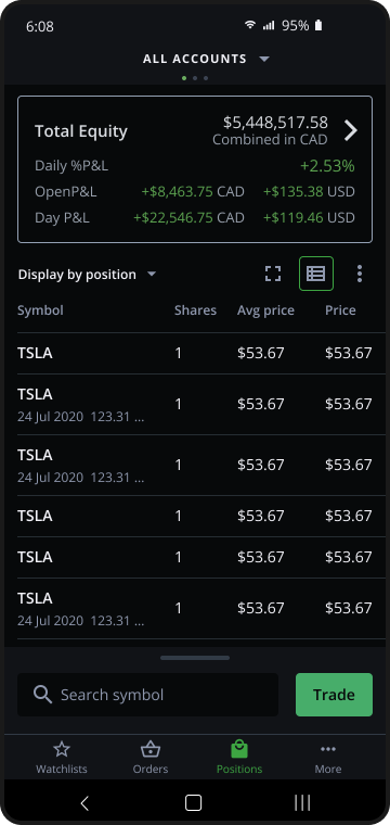 Direction 1: strongest hierarchy
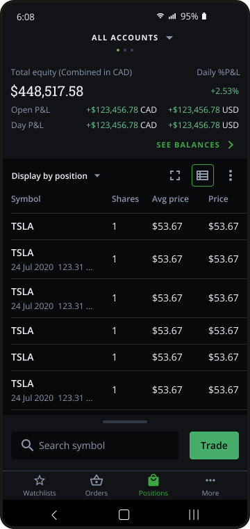 Direction 2: total highlighted
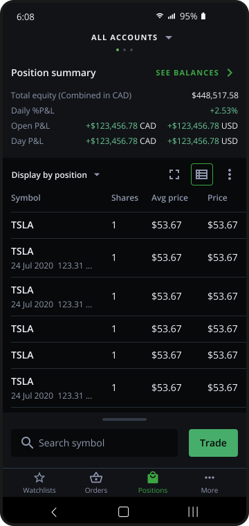 Direction 3: clearest relationship
Letting people set the navigation model
The final design distributed the work across the header, account list, and reordering interaction. Each supported a different moment in the same decision:
- Balance header: see the balance and six-month performance trend, swipe between accounts, or tap to open the full list.
- Account list: compare every account using the type and balance information people relied on to tell them apart.
- Reordering: put the most important account first and use that same order when swiping through the header.
That last piece is the one I would point to. It turns a preference into the navigation model. The order a person chooses is the order the interface uses, so control and speed reinforce each other.
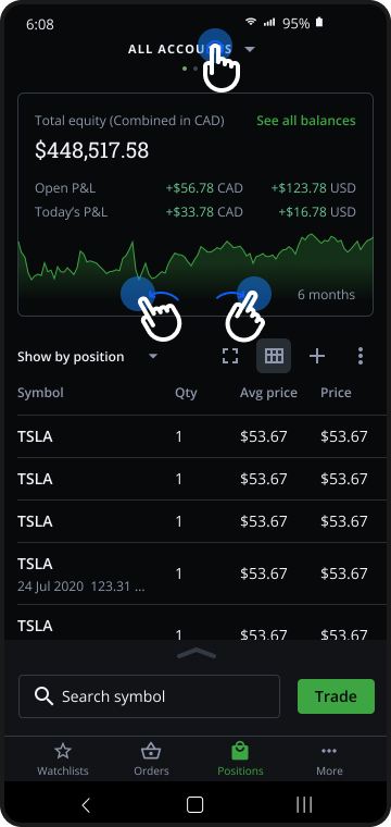 Balance header: performance and navigation
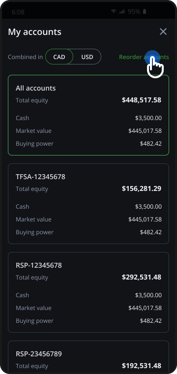 Account list: tell them apart
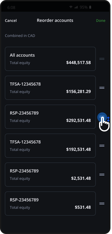 Reorder: sets the swipe order
What changed
I'm spending significantly less time managing my accounts, giving me more time for strategic trading decisions.
Active trader
The new design clearly presents detailed balance info, exactly the insights I need without digging through menus.
Product stakeholder
What changed in my approach
A user’s mental model can shape the structure of the product. Once we stopped asking people to remember account numbers, the header, list, gestures, and reordering began to support the same way of thinking. I have carried that balance between clarity and control into every financial product since.
The deck
The full walkthrough includes the account-list directions we tested, the options we set aside, and the reasoning behind the final system. Open the deck ↗